In fast-growing Asia Pacific, distinctive branding has become ever more essential in cutting through the intense competition between local and international brands.
With great technological and economical change over the past decade sweeping through the region—home to both the largest economy by GDP in the world in China, and the fastest growing economies in the likes of India, Cambodia and Bangladesh—this has only intensified competition. Those who have successfully distinguished themselves have helped place Asian upstarts on the global stage.
As we approach a new decade, Campaign asked brand specialists JKR, Landor and Superunion which Asia-Pacific brand designs they believe stood out most from the 2010s. Chinese brands have a strong showing, including two votes for Tmall. Some global brands do feature on the list.
|
This article is filed under... In retrospect: How the industry changed in the 2010s |
René Chen, partner, JKR Shanghai

1. Oatly

Disruptive. At a time when people are not accepting oat milk, the visual language not only changed the brand but sets the tone for the oat milk category. The font design perfectly fits the copy style created a chic community vibe. A distinctive brand world that changed the perception of the whole category.
2. 2015 World table tennis championships Tokyo

“Aesthetics is the reflection of a culture”. Championship tournament is more than just sports, it's a culture hub and a showroom privileged to its host. These posters are reflections of the essence of the Japanese minimalism culture and design made it possible to communicate this wisdom of years through shapes and shade on a frame.
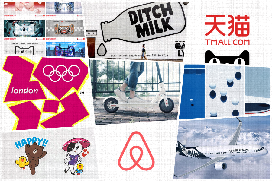
3. Tmall 11.11 campaign

Design created the foundation and the collaborative culture carried it into a community. Double eleven was no longer an e-commerce shopping festival but a gala for brands to show their personalities. Design served as the foundation for the event. The cat-head design was strong yet flexible enough to let brands show who they really are while participating it. The design sends an inviting collaborative message and made it possible to carry on to a global event.
Andy Reynolds, head of creative Asia, Superunion

1. London 2012

With jam packed stadiums and an entire city cloaked in a festive frenzy for four weeks, London 2012 is hailed as one the most successful Olympic Games in memory. However when the event logo was released, it divided the nation…and the global design community. The logo was described by the press as Marmite—you either love it or hate it—with one tabloid even labelling it as ‘Lisa Simpson performing oral sex’. There were cries of it being a national embarrassment and alternate designs were submitted left, right and centre. However the organisers stuck to their guns, with the rationale that the style resonated with many of the nation's youth. Love it or hate it, in the end the logo and design system conveyed to the world that London was a contemporary, youthful and energetic city that’s not afraid to zig when the rest zags.
2. Airbnb

Airbnb is, without question, one of the decade's game changing brands. Along with the likes of Uber and Netflix, it has redefined an industry on a global scale. In 2014, the brand identity was pretty forgettable, until it launched the ‘Bélo’, an icon designed to symbolise belonging. The new icon and brand identity were designed to reflect the idea of ‘belong anywhere’—conveying the notion that travellers can live like locals rather than tourists. The success of the brand idea and design is demonstrated through the multiple award-winning global campaigns that have launched from its foundation.
3. Tmall* (again!)

In 2014 Alibaba created Tmall, China’s first direct to consumer, global ecommerce site. Tmall, meaning Skycat, needed to capture the hearts and minds (and wallets) of a billion people before it could even think about becoming a platform for international brands. Superunion created a simple cat mascot in the shape of a T to do the trick. Our (somewhat) shy, but cheeky little cat soon started to pop up in the most unlikely, but relevant, places and became a useful guide for customers on their ecommerce journey. Six years later, the results speak for themselves. With over 500 million active monthly users and 180,000 brands from 74 countries, Tmall is now the third most visited website on earth (behind only Google and Youtube). And that shy, cheeky cat is now as ubiquitous as white on rice.
*Disclaimer: Superunion was responsible for this Tmall work
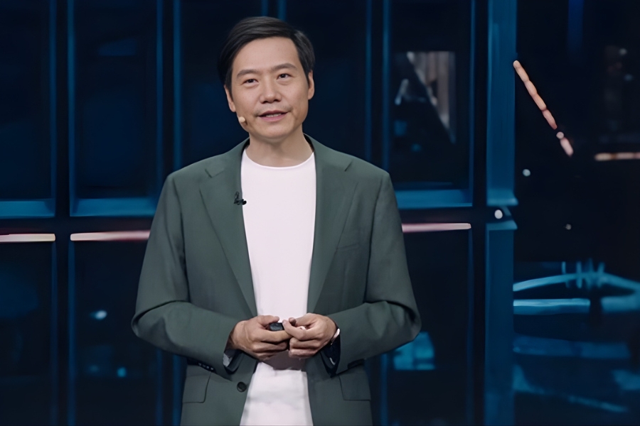
Mo Saad, regional creative director (pictured) & Zheng Joo Tan, senior designer, Landor

1. Air New Zealand
In past years, familiarity with Air New Zealand was often restricted to the Australian market. But the 2010s saw the brand embrace a design thinking strategy that rippled through the globe with such force that it not only acquired the title of 'World’s Best Airline' (2019) but became the benchmark for trendsetting innovations and unconventional marketing tactics. The brand’s creative flair is not restricted to its simple yet relevant visual identity; it has gone beyond the obvious and pioneered a new way for passengers to engage with inflight safety videos, paving the way for other airlines to bring fun and cheekiness to the cabin experience. Our favourite product innovation remains the ‘Economy Skycouch’—a row of economy seats that can be turned into a couch after take-off—a thoughtful and creative way to turn a common passenger behaviour into a sales feature and continue to challenge the ordinary.
2. Xiaomi

Xiaomi turned heads back in 2014 when it became the number one mobile phone manufacturer in China, earning it the title of “China’s Apple”. Two years later, the brand responded to a decline in sales by reinventing itself as an ecosystem of thoughtfully designed home products for the digital age. One thing has always set the brand apart: super affordable products for above average quality. Now that award-winning product design and packaging has entered the picture, Xiaomi has paved the way for design enthusiasts to embrace the brand’s philosophy. Xiaomi’s visual identity may not be anything to marvel at, but it is the Bauhaus-inspired, pure white aesthetic of its offerings that once influenced the likes of Apple, Nike and Braun that now attracts more and more customers seeking beautiful products at attainable price points. This is a brand that has true potential to brave the boundaries of APAC and infiltrate western markets through design-led innovation.
3. Line Friend Stickers
Line Chat started off as a free messaging app back in 2011. The interface might at first appear functional in comparison with WhatsApp’s clean, intuitive design, but the company found success through their sticker designs and games, turning the famous Line characters into their own brand, and giving them a life beyond the app. Line Friends characters have created entire universe: from mall activations to merchandise to cameo appearances on Times Square in New York, their influence knows no bounds. The beauty of these characters lies in their simple, understated visual design, which allows each character’s distinct personality to shine through. This allows flexibility, ensuring they effectively withstand technological disruption and continually adapt to new markets. Line has made stickers meaningful and personalised, completely changing the world of shopping and communications via mobile, whilst turning the original chat app into an online and offline ecosystem.