‘Wabi-Sabi’ is the Japanese worldview that prizes the beauty of transience and imperfection. It has no direct translation in English, but it connotes ideas of isolation, simplicity, longing and a closeness to the natural world.
It explains the Japanese aesthetic: understated, contemplative and elegant. According to Suntory’s chief bartender, Takayuki Suzuki, it also explains his company’s approach to whisky manufacturing. You can watch him rustling up a scotch on the rocks and making it look like an art form here.
Suntory has been making whisky in Japan since 1924 when Shinjiro Torii (aka ‘the nose of Osaka’) built the first Japanese whisky distillery outside of Kyoto. Japanese people laughed at his vision to sell Scotch whisky in the domestic market, whilst single-malt connoisseurs in the West sniggered into their crystal tumblers. But he persisted, and his blended whiskies finally came of age—both in terms of product taste and design aesthetic.
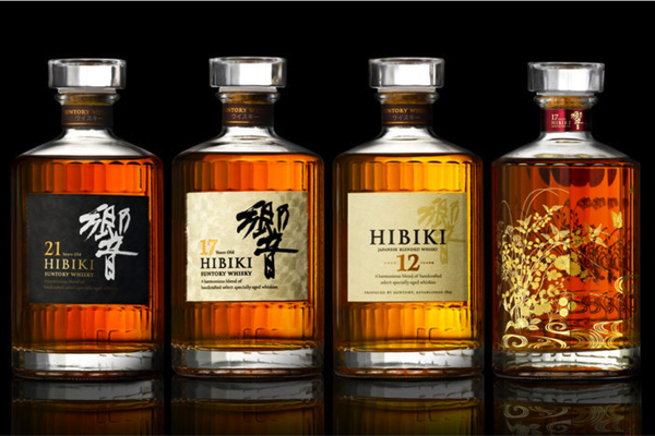
 In the Scotch whisky category, there is a set of visual signifiers we intuitively ‘read’ to infer notions of authenticity, heritage, complexity, strength and so on. Hibiki and Yamazaki share none of these established category codes. And yet, we don’t doubt that similar notions are suggested by this very different style of packaging. They feel credible, but they also feel quintessentially Japanese.
The Hibiki bottle design in particular, with its distinctive 24 faceted profile, is inspired by the 24 hours in a day but also the 24 segments in the Japanese lunar calendar. The label is made from traditional hand-crafted paper called washi, whilst the name ‘Hibiki’ means ‘resonance’. It’s potent, poetic stuff. And it’s a million miles away from images of highland glens and silhouettes of stag heads.
It wasn’t always like this. When Suntory started out, the company clearly looked to Scotch whisky for inspiration and direction. A bottle from 1929 (left) apes the conventions of the Scotch whisky category: big label, centred composition, gothic type and quasi-Christian symbolism. But eventually Suntory whisky brands found their voice.
Which just goes to show. If you can’t join ‘em, beat ‘em.
|

