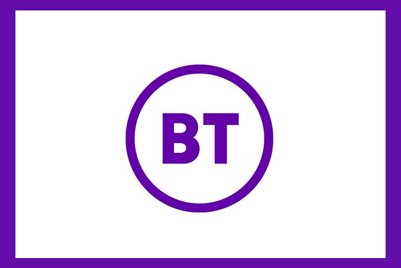
BT's new brand logo has been met with ridicule from the industry after it unveiled a monochrome design that is almost identical to one revealed three years ago.
The telecoms and media company has filed a trademark application this week with the Intellectual Property Office for the new logo, which is the same in form as one it wanted to create in 2016.
The new logo, with the letters BT in a sans serif font surrounded by a circle, does not have the mixture of colours that was proposed in the trademark it applied for three years ago.
Even though the trademark was for a black design, a BT spokesman shared images with Campaign that show the brand in purple. Trademarking in black is deemed a neutral colour and allows the brand to use the logo in any colour it chooses, BT said.

"Our chief executive has been very clear that the new mark symbolises real change," a spokesman said.
However, social media users have turned the simplistic design into a meme, with brands such as Poundland getting in on the action.
Poundland trolled BT by claiming it had spent £1 to transform its own logo with a similar design.

Matt Michaluk, creative director at retail and brand consultancy Fitch, said the new logo had removed the personality that could differentiate the brand in an increasingly competitive market.
He said: "The new identity signifies change, but it positions and displays BT as another generic, unemotive brand.
"The design neither builds on the heritage of BT, nor signifies a direction or purpose that consumers can relate to or engage with."
The branding is part of new chief executive Philip Jansen’s push to revitalise BT after replacing Gavin Patterson in February.
BT shares have been hit in recent months amid an Italian accounting scandal and a £1.5 billion (US$1.91 billion) cost reduction programme in which 13,000 staff are due to be laid off.

The new branding is still being finalised and is expected to be rolled out in the summer.
Michaluk added: "Change in major organisations is a huge challenge, so it’s great to see brands like BT embracing this. However, they must take a consumer-centric approach, thinking about the scale of today’s market and how they connect meaningfully across it."
Greg Quinton, chief creative officer at Superunion said the apparent lack of progress since 2016 left him with "more questions than answers".
He added: "The basic design questions: Is the circle meant to represent a fibre optic tube? If so, why is the colour on the outside of the tube rather than inside? Why are the letters floating in the tube?
"The old BT typography was poor, but why is the type so neutral, where is the energy, the promise and future enabling brand we need? The big question though is, where is the brand actually going? No answers yet, so for now we remain on call waiting."


