Ogilvy, which turns 70 this year, decided to 'refound' itself in June with a makeover worthy of a pop star. As well as reorganising itself and expanding its consultancy business, the agency also gave itself a subtle but significant new look by redrawing its logo, updating fonts, rehashing linguistic standards and putting a glossy finish on the lot with a new, brighter colour scheme.
The agency took pains to describe the updated brand colour as a ‘reintroduction’ of the ‘iconic Ogilvy red’. But while the new deep pink falls within the same colour spectrum as the old bright red, it is also an entirely different shade in its own right and comes with a fresh secondary palette of gray, pink, blue and yellow, all designed to “emphasize the company’s desire to modernize”.

Colour is just one element of the set of semiotics that can convey meaning to consumers but, as exemplified by Ogilvy’s makeover, it is often a brand’s most recognizable signifier and therefore the easiest way to indicate a change in direction, a new target audience or a different outlook. Brands have always known this but with the rise of social media, experts are seeing colour taking on new significance.
“I think that if any particular brand is feeling that colour is a secondary consideration, they should really think twice,” says Wui-Liang Lim, content research lead for APAC at Shutterstock. “I feel colour is the most important aspect, especially today. The first thing someone looks at is colour.” While brands in Asia are adept at using colour to stand for deep-rooted cultural meaning — red, considered lucky, is popular in Chinese New Year ads, for example, while green is used in ads associated with Ramadan — they are also starting to use colour in more subtle ways to tap into certain sub-cultures and ideas, thereby finding ways of targeting new consumers.
“Colour can be a strong marker of identity and self expression,” says Gareth Lewis, head of APAC at the semiotics insights agency Space Doctors. “The dominance of the visual in social media more and more over the written word means that brands are really responding to that.”
The photo-sharing network Instagram hit 1 billion users last month, 13.5% of the world’s population, and one indication of the importance of colour on the site is that 18% of Instagram posts use a filter, according to a study of around 40 million posts by Relatable. A quarter of these feature photos adapted with the most popular filter, Clarendon, which makes an image look brighter and bolder by lightening light areas and darkening dark areas. It also makes dominant colours stand out, which makes it popular for sunset shots.
“Instagram obviously has a huge impact on colour,” agrees Lewis. “The richness, the vibrancy, the youthfulness, the way they pop on the screen is immediately obvious.” Lewis sees an overall trend towards brands using the kinds of palettes that the Clarendon filter creates: bright, rich shades that stand for freshness, youthful energy and a “future facing global culture”, rather than the pastels and more muted tones of a few years ago.
‘Punchy pastels’, in fact, were one of Shutterstock’s creative trends for 2018: neutral colours updated with a new, bolder twist. Searches for ‘blue candy’, for instance, rose 600% recently, according to Lim. “Punchy, strong colours in content are definitely becoming more common due to multiple factors, including the rise of mobile and people just wanting to get attention,” he says.
Some brands now design their products specifically to look good on Instagram. Take the Australian towel brand Tesalate, whose vibrant patterned designs appearing beside brilliant blue swimming pools or on bright sandy beaches make for ideal Instagram material. Or Adidas, which said that its new Deerupt trainer line, released in March and available in two “electric” adidas tones (Solar Red and Bluebird) was designed with Instagram posts in mind. Lego, with its bright block colour products, is another brand that does particularly well on social media: it has an audience of 2.8 million on Instagram. In China, where Instagram is banned, the different functionalities of the various top social networks, from WeChat to Weibo to Douyin, may well have an impact on which colours brands choose to work with, says Lewis.

Designing for social works in reverse, too, with Lewis saying he’s also seeing real-life stores playing to the colour schemes and visual constructs beloved of social media users. Remicone, a Korean ice cream brand that’s now expanded to China, is one example: its ice creams have huge, lurid candy floss toppings and are decorated with bright, easy visual symbols from umbrellas to hearts, fruits, flowers or sprinkles (see below). “[This is] not only to create an astonishing sensory experience when it’s in front of your eyes or in your hand, but also to be as impactful and tantalizing as possible when shared across social media,” says Lewis.
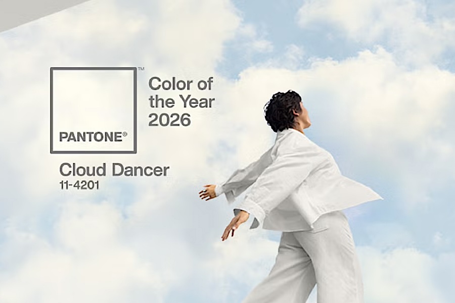
The colour pink is also a predominant trend that’s been used by brands chasing a younger audience for the last couple of years. The ‘millennial pink’ fad could be dated to 2016, when Pantone chose ‘rose quartz’ as one of its colours of the year along with a pale blue shade called ‘serenity’: the two colours were meant to signify the new blurring of gender lines and the hunt for calm and mindfulness in a hectic world. Dismissed by many as an indulgent marketing ploy, millennial pink has in fact proved to have a certain amount of staying power, with the graphic designer Aaron White observing in a recent Shutterstock blog that a search for millennial pink turns up almost as many ‘it’s over’ posts as articles about its continuing relevance.
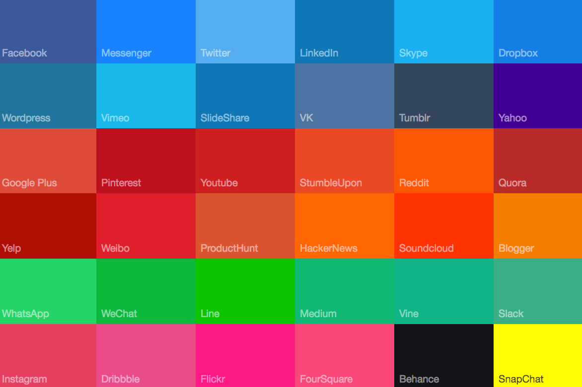
A more recent, inevitable follow-up to millennial pink has been ‘Gen Z yellow’, a bright canary colour that became an established 'trend' after it was seen on various young models from Gigi Hadid to Kendall Jenner last year. It, too, has been hailed as a colour that sums up young people’s restlessness, optimism and preoccupation with gender fluidity.
Media hype aside, there is some value to understanding why these colours that purport to define a generation’s tastes are popular, says Lewis, who thinks the proliferation of pale ‘millennial’ pink in recent years is particularly interesting.
“Millennial pink has associations with health and wellness approaches, maybe androgyny and sexual fluidity,” says Lewis, who notes the use of a “fleshy” pink in many beauty products. “It’s a colour that's quite tactile, it’s quite a skin-like tone. It plays to that millennial state and you can see how it fits there, particularly in cosmetics.”
He points to Fenty Beauty, the cosmetics line launched last year by Rhianna that aims to provide makeup for all skin tones, and the Korean makeup brand 3CE as examples. 3CE (3 Concept Eyes), the sister brand of the fashion store Stylenanda, has stores decked out in pink and gold, which Lewis thinks plays into ideas of “rosy youthful innocence with a touch of naughty”. As well as being highly Instagrammable, the colours also “mirror the predominant K-beauty look of pink flushed ‘nubile’ beauty” and help to position 3CE between overly “cutesy” brands like Etude House and more upmarket brands like Hera. “It’s got the right mix of luxe, (aspiring) sophisticated appeal...and youthful seduction,” says Lewis.
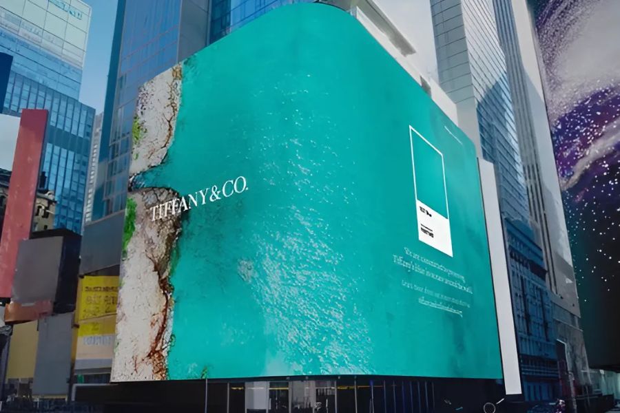
It’s nothing new for product categories like beauty to be dominated by one or two key shades. Shaving products are most likely to be blue and white, for instance, while men’s personal care products typically use bold blacks, greens or blues. But more recently, category identities have started to evolve in an interesting way. Where green was formerly the key signifier for eco-friendliness, for example, a 2015 study by researchers from the University of Oregon and University of Cincinnati found that the colour blue actually conveys this idea more effectively. This may explain why products like BMW i3, BMW’s new electric car, comes with the option to add a ‘Protonic blue metallic’ paint job, to symbolise freshness and cleanliness.
Bold, recognisable colours like blue are also useful for adding a grounding element to nebulous concepts like artificial intelligence, says Lewis.
“I think that era of white, matte cleanliness and also colourlessness is over. I think you're going to start to see stronger colours that signify liveliness and presence. These are patterns we actually see, maybe around that scary AI that is colourless and a little bit non expressive there's a move to infuse those technologies with colours that signal that they're based around human beings who feel.”
Both Lewis and Lim think that colour’s importance will only grow for brands, especially because of new products like IGTV, Instagram’s new long-form video feature designed to rival YouTube. “If advertisers want to produce content on IGTV they need to think how colour is going to play out on this,” emphasises Lim.
Both also caution against gratuitous use of trending colours, however. “One of the challenges if you launch a brand in 2017 or 2018 in Gen Z yellow or bright blue as your overall identity, is what will happen in five or 10 years time? How can you ensure that that colour remains relevant day to day?” asks Lewis. “Colour is a carrier of cultural meaning, so you’ve got to treat it with the respect you would treat any carrier of cultural meaning, with sensitivity and intelligence.”
|
Ultraviolet: the colour of 2018?
Pantone nominated this 'blue-based purple' as the colour of 2018 to suggest, among other things, the 'intrigue of what lies ahead'. The shade has associations with counter-culture and spirituality, which ties in which the procupations of Generation Z, said to be more open-minded and reflective than their predecessors.
|

