Cadbury is one of those heritage food brands, like Heinz or PG Tips, that can offer a lot of comfort in these uncertain times. For that reason, the chocolate maker’s branding overhaul—which has launched in Australia and will arrive in the UK in early 2021—might feel quite timely.
Even iconic brands need the occasional spring clean in order to get the chance to chuck out what doesn’t fit and rediscover some long-lost gems. Cadbury is following in the footsteps of Kellogg, another great heritage brand, which last year launched its biggest brand identity overhaul in its 113-year history. Kellogg’s makeover saw its logo enlarged and the design on its cereal boxes simplified to give more standout in the supermarket aisle.
As FMCG brands grow and expand, their look can become as crowded as their portfolios, so it is crucial that marketers take the opportunity to ensure there is harmony, consistency and clarity across a brand’s range and coherence throughout the imagery, typeface and logo.
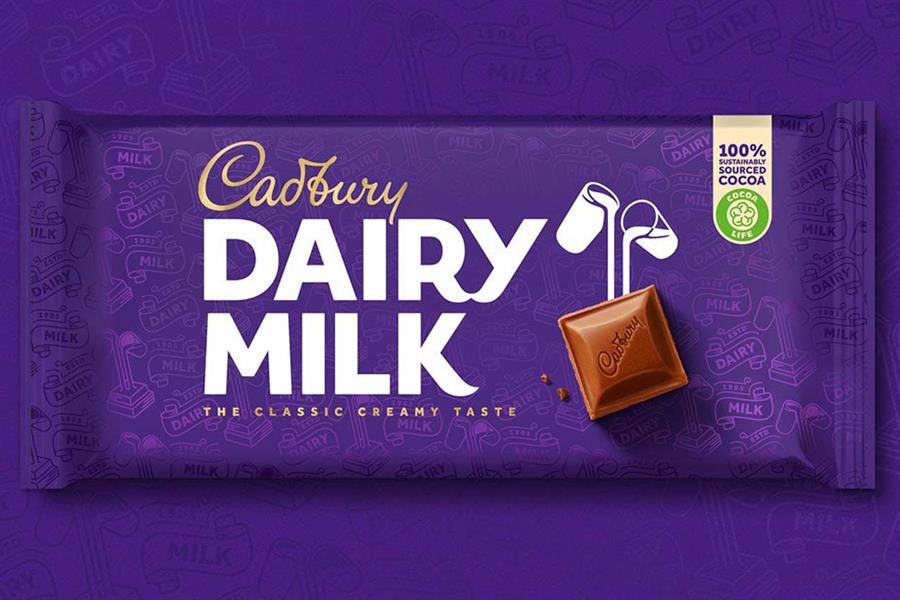
In Cadbury’s first image revamp in 50 years—led by design studio Bulletproof—the new design emphasises the brand’s great history while giving it a cleaner, more modern look and feel. The Cadbury wordmark, inspired by the signature of founder John Cadbury’s grandson William, is now more refined and elegant.
The "Glass and a half" icon has an added square of chocolate, bringing an element of excitement and puts the product, along with its ingredients, front and centre. The new Dairy Milk logotype has a bolder, fuller typeface, taken from the original packaging from 1905—this not only helps reconnect the brand with its roots but adds simplicity and confidence to the overall look.
One slightly weaker aspect is the new recurring Dairy Milk motif, inspired by ribbons used in the packaging in the early 1900s, that runs all over the purple packaging. The pattern is an arguably unnecessary addition, although it does manage to add a bit of dynamism to the classic purple backdrop.

Over the years, big brands can get a bit lost with the conveyor belt of marketers making their own stamp along the way. The company grows and expands with a parade of variants and pack sizes and the brand identity can start to look untidy and confusing. That is when brand guardians should take a step back to review the imagery and pare it back to just its most important elements.
Packaging can become overloaded with badging and certification marks. In Cadbury’s new design, the extra messaging and noise has been cut back, with just a nod to its commitment to sustainability sitting alongside the main elements of the branding. Digital is also forcing brands to hone in on what is important and to remove the baggage that gets picked up over the years.
Like many other heritage brands, Cadbury will be facing challenges from private label and newcomers to the market. To stand out on the shelves and to compete through digital channels, the look and feel need to be simple, elegant and exciting.
Of course, these changes are still relatively subtle and consumers may not even notice them on a conscious level. Nonetheless, the redesign will give Cadbury’s chocolate a stronger presence online and offline, and more relevance to a new generation.
Nick Vaus is partner and creative director at Free the Birds