

Please sign in or register
Existing users sign in here
Having trouble signing in?
Contact Customer Support at
[email protected]
or call+852 3175 1913
The 15th century chapel and its famous, early 16th century ceiling have a lesson for marketers about the difference between a user experience that provides great utility and one that provides not only that but also great content.
Contact Customer Support at
[email protected]
or call+852 3175 1913
Top news, insights and analysis every weekday
Sign up for Campaign Bulletins

.png&h=268&w=401&q=100&v=20250320&c=1)
Citing violations of the Antimonopoly Act, Japan's Fair Trade Commission fined Dentsu and six other firms ¥3.3 billion (US$22.8 mil) for bid-rigging tied to the Tokyo Olympics. Dentsu is contesting the 'discrepancies'.
.png&h=268&w=401&q=100&v=20250320&c=1)
As rainbow logos vanish and corporate sponsorships dwindle, Pride 2025 reveals a new era of caution and introspection for brands navigating political pressure and demands for authenticity.
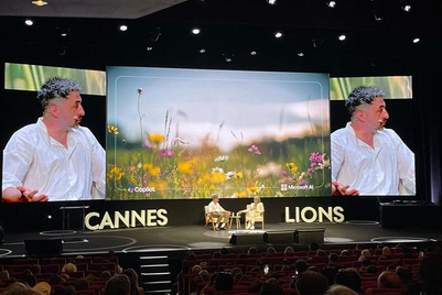
Mustafa Suleyman was joined on the stage at Cannes by Colleen DeCourcy to discuss how AI will democratise creativity and the importance of ‘friction’.

With bold campaigns, record-breaking new business wins, and a near-perfect client retention rate, the agency proved it could lead from the front. Yet, challenges in China and the pressures of rapid growth loom large—testing whether its ‘disruption’ can stand the test of time.
.jpg&h=334&w=500&q=100&v=20250320&c=1)


.png&h=334&w=500&q=100&v=20250320&c=1)


.png&h=334&w=500&q=100&v=20250320&c=1)


