Background
Turnbull Bros. Orchards embraces a traditional artisan approach to growing, picking and distributing fruit, established by the family over a century ago. The company eliminates unnecessary handling to maximise the freshness and quality of its hand-picked apples, pears, cherries, nectarines and peaches.
Aim
In partnership with independent brand agency Truly Deeply, Turnbull Bros. set out to create an identity and packaging solution that highlights the premium nature of their brand and hit eight to 10 premium grocers that also stock high-end retail products.
Execution
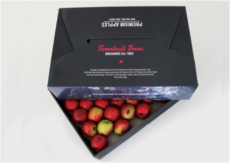
Following a market evaluation which revealed an abundant use of colour, the agency concluded that a key part of the solution was to provide economic packaging that would stand out in wholesale and supply a preferred display in store.
The result was a series of grey-toned cartons with a 'retro red' brand mark—higlighting the natural colour of the fruit and representing a modern interpretation of the brand's rich heritage.
In addition to the cartons and stickers, Truly Deeply created an image library and new website to illustrate the history of Turnbull Bros. Orchards.
Results
The new identity was first revealed at the Footscray wholesale market. After only three days, 50 per cent of the target was acheived.