Katie Ewer
Jun 13, 2014

Asian Champions of Design: Redheads matches

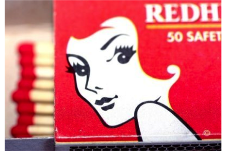
Redheads matches are a rare example of a brand that seamlessly ties together product, name and design.

Asian Champions of Design: Redheads matches

This Australian brand’s clever, versatile visual identity has given its owners a way to truly own a totally generic product attribute.

So-called because of their red tips (a first in Australia back in 1909), the first Redheads logo to feature a woman was created in 1946, and first used on packaging in 1947. Modern, classy and attractive, ‘Miss Redhead’ soon became the girl every Aussie bloke wanted to take to the barbie.

In 1975 the packaging was redesigned to invert the colour balance of the pack, making it predominantly red. The brightly coloured pack instantly secured improved visibility on shelf. But the new design also solved one of the brand’s nagging issues: if your brand identity centres around a woman’s haircut, what do you do when that haircut starts to date? By the mid 1970’s, the scarlet seductress was beginning to look like someone’s grandma. But by allowing her face to emerge out of a red background, she became eternally youthful. We can imagine whatever hairstyle we like for her.

Redheads are also well known for their limited edition collections, which date back to 1959 (every collection is catalogued on their website under the alarming tab ‘Fun with Matches’). Decades before digital print and algorithms created design campaigns like ‘Share a coke’ or Absolut’s Cobalt series, Redheads were creating witty, inventive designs that celebrated their brand equity, analogue style.

One of the more recent editions is called ‘Australia’s Big Things’, which makes no sense to me as a non-Australian, but it does have a rather nice offset retro print feel. Presumably it’s an in-joke intended to shore up the brand’s positioning as an indispensible part of Australian life. 

Either way, what make this brand a Champion of Design is the attention and creativity it pores into a very humble thing: the lowly match box. Something wonderful happens when an everyday product is paid the compliment of carrying a great idea. Redheads does that with every little card box that it prints, and over time it has built an iconic, imaginative identity that’s becomes part of Australia’s visual heritage.


Original logo (1946)

Australia's Big Things (2010)
Redheads through the years

Matches of protest

Redhead random facts

  1. Dickheads matches were launched in 1999 by Australian businessman Dick Smith, apparently as a protest against Australian brands selling out to foreign investors. (P.S. Dickheads matches were made overseas.)
  2. Matchbox collectors are called phillumenists, which comes from the Greek ‘phil’ (meaning ‘loving’) and the Latin ‘lumen’ (‘light’). 
  3. Before Redheads introduced its red tipped ‘safety match’, most people used matches tipped with poisonous white phosphorus.


Katie Ewer is strategy director at JKR Global in Singapore.
Check out the rest of the Asian Champions of Design series.


Source:
Campaign Asia

Related Articles

Just Published

5 hours ago

New Balance boasts deep roots and universal appeal ...

Shot in 16mm, the seven-minute film shows various subcultures’ attachment to the brand.

5 hours ago

Advertising is still failing moms

A survey of moms across the industry uncovered the ways they continue to be underserved and undervalued at work.

5 hours ago

S4 Capital reports 11.7% revenue drop for first ...

Sir Martin Sorrell said that the group will continue to capitalise on AI positioning.

5 hours ago

Peroni Nastro Azzurro launches global creative review

The process is being handled by AAR.