We're used to press-release puffery, but a new announcement from Ikea and 72andSunny Amsterdam really takes the Allemansrãtten. We doff our hats in tribute to the anonymous genius who wrote it. For that noble person turned what could have been a single sentence—72andSunny has created a white version of Ikea's logo on a transparent background for use across digital content—into a masterpiece.
It took us three or four perplexed read-throughs to grasp what it was on about, but such is the price of true artistry. To be honest, we're still not sure whether the release represents an agency desperate to justify its fee or a satire of overblown press releases, but we'll treasure it either way.
|
This post is filed under... Stranger Things: A reporters' notebook of WTF items A growing collection of stupidities and things we just can't explain. |
We planned to share just a few of the phrases and passages that caused our jaws to hang open in awe, but then we realised it would be an injustice to slice and dice this seminal work. So here's the entire text:
As part of their successful pitch to lead the design strategy for IKEA logo optimisation, 72andSunny Amsterdam have created a dynamic application of the IKEA logo called ‘The Fönster’. The Fönster forms part of a logo system that is designed to reinforce and integrate the brand into modern touchpoints.
Inter IKEA Systems, the IKEA franchisor, continuously observes and adapts to meet the needs of consumer behaviours and have chosen this moment adopt a new approach, proposed by 72andSunny, that approaches logo design with digital and mobile as the starting point.
Fönster (Swedish) translates into English as “Window” and is designed to reflect the point at which IKEA connects with the world, and the world connects back with IKEA. The transparency reflects core IKEA values of openness, curiosity and optimism that have been central to the brand as they strive to create a better everyday life for the many people.
The Fönster complements the existing and iconic IKEA blue and yellow logo (also optimised as part of the recent process). It will be used to tag and brand IKEA content that isn’t consumed in traditional channels by highlighting specific details, providing different perspectives and complementing work created with any increasing array of partners and collaborators.
Being white and transparent, The Fönster neatly integrates into the beginning, middle or end of digital content, clearly signalling the IKEA Brand and creating more opportunities to integrate the brand with emotional stories.
The Fönster builds on and formalises behaviour that was starting to happen naturally by providing a set of design and implementation guidelines for anyone working with the IKEA Brand.
Carlo Cavallone, Executive Creative Director, Partner at 72andSunny Amsterdam said:
“We have created a future proof version of the iconic IKEA logo. It has been optimised both in form and function, and is now more relevant and effective for the future touch points of the IKEA Brand because it will open up a deeper, and far more emotional connection, between IKEA and a wide audience of people.”
Åsa Nordin, Identity & Symbols Leader at Inter IKEA Systems said: “The Fönster represents an opportunity for IKEA to integrate itself with users and in the market place more than ever. In a world where we can’t predict where IKEA will show up, we need a logo evolution that would allow us to be present and relevant in now and in the future”.
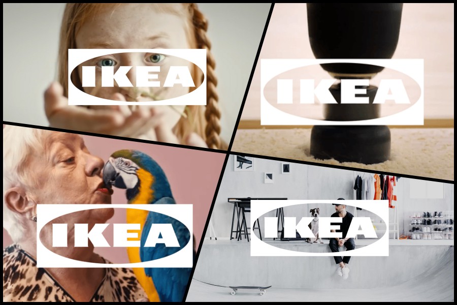
Brace yourself, because here's an example of The Fönster in action:

Wow, right? Even the parrot is speechless.