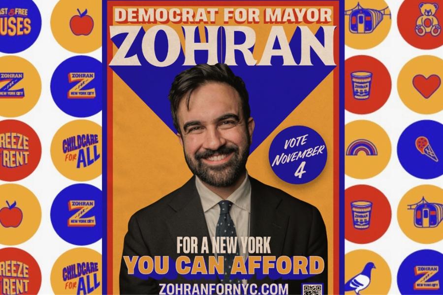
In most political campaigns, design is often the last item on the checklist. Pick a colour, slap on a slogan, and pray that someone will notice your sign in the forest of lawn clutter. The assumption is that most voters don’t care how a campaign looks, only what it says.
But what if design didn’t just decorate a campaign—like those happy folks standing behind the candidates on the campaign trail? What if it drove it?
That’s what happened when Zohran Mamdani, the Democratic Socialist and former state assemblyman, ran for mayor of New York and won.
His volunteers weren’t just knocking on doors; they were collecting stamps. Each was given a “Zetro card,” a clever riff on the city’s MetroCard. Every time they canvassed, they got a stamp; fill the card and you earned a limited-edition poster or T-shirt.
Campaign merch so desirable, it became social currency. Imagine that: design not just as branding, but as the fuel for a political campaign.
Most political branding in this country is beige (actually red, blue, orange or green) wallpaper. It's flat, safe, and forgettable. A serif here, a maple leaf there, and a generic slogan about change or going forward together.
Ironically, many campaigns promise change, yet few change how they look.
And, in a crowded, polarised media landscape, sameness is death. When every party starts to look the same, design becomes one of the few levers left to stand out, not just on the street, but in the hearts of the people (often young people) who power the campaign.
Designer Aneesh Bhoopathy said the goal was to give it “a human touch.” Mission accomplished. The campaign looked like something that already belonged to New Yorkers instead of something asking for permission to.
The posters were the showpiece. Created by Tyler Evans, a veteran of Bernie Sanders’s design team, they stripped the message down to a single word: “Zohran.” Bold. Minimal. Unmistakable. You could spot one from half a block away. And you wanted one badly.
The design didn't just look different, it signalled belonging. This was politics translated through the vernacular of everyday life. A pretty good idea when you're running on affordability for everyday people living everyday lives.
And in doing so, it tapped into something brands have long understood: design builds community. Just as sneakerheads line up for the latest drop, Mamdani’s supporters lined up for posters and T-shirts that meant something. These weren’t giveaways; they were badges of belief.
The Zetro card might have looked like a gimmick to veteran political strategists. It was a strategy.
Every stamp represented another door knocked, another conversation, another act of participation. Volunteers weren’t managed; they were motivated. The design made the campaign tactile, playful, and addictive. That’s what most campaigns miss. They fail to recognise that design’s real power is mobilisation. The ground game is about emotions as much as logistics. The best design doesn’t tell you what to believe; it makes you proud to belong.
Canadian political design has long been allergic to risk. The visual ambition rarely rises above “visible from a distance.” (See above re: lawn signs.)
Mamdani’s campaign didn’t just persuade; it seduced. It reminded us that good design can sell an idea and move people to act on it.
Perhaps those responsible for orchestrating the party's ground efforts for the next federal campaign in Canada will recognise the power of design and demand more out-of-the-box thinking from those who make the campaign posters and podium cards.

