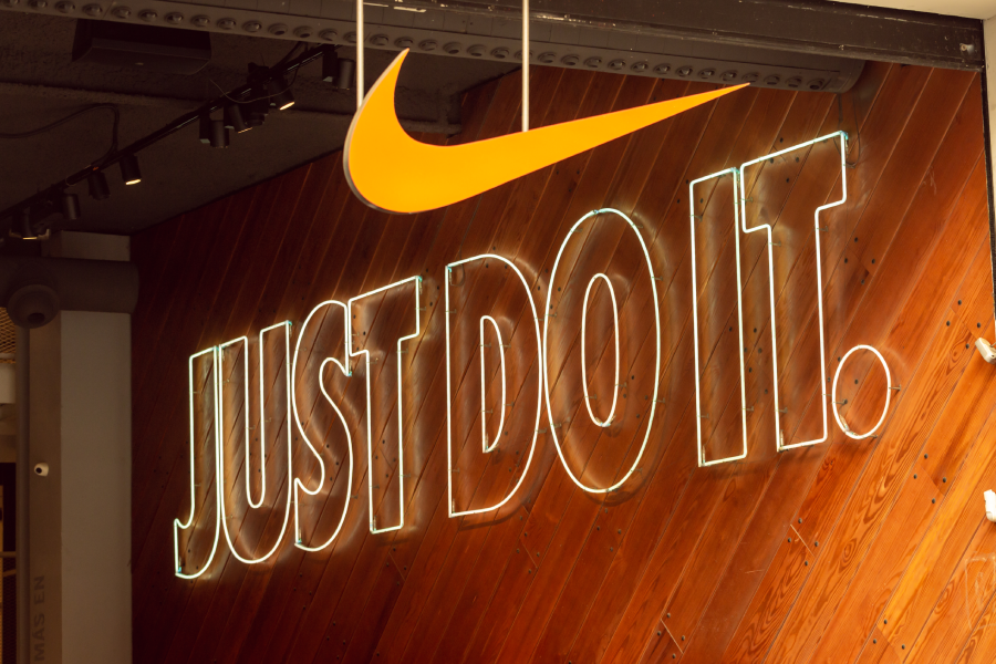
Few taglines are as instantly recognisable as Nike's 'Just Do It', often accompanied by its famous swoosh symbol. The sportswear giant first introduced the memorable slogan in 1988, crafted by Dan Wieden, co-founder of the advertising agency Wieden+Kennedy. The tagline quickly lodged itself into the cultural lexicon, helping Nike rise to dominance in the sports apparel world.
In a bold move, Nike recently gave the tagline a fresh twist with the launch of its new campaign, 'Why Do It?'. You might wonder, if it’s not broken, why fix it? But Nike's CMO, Nicole Graham, explained that the shift is an attempt to meet young athletes where they are, many of whom are hesitant due to fear of perfectionism and cringe culture, and inspire them to embrace courage and possibility.
In her words, the campaign “isn’t retreating from [Nike’s] bold legacy, it’s deepening it… It’s a call not to compete harder, but to reflect deeper.” According to Nike, the campaign addresses a generation seeking meaning, emotional resilience, and authenticity, not just athletic achievement.
In other words, it's Nike's attempt to stay relevant and engaged with the youth. Narrated by Tyler, The Creator and featuring top athletes, the 'Why Do It?' campaign aims to spark self-reflection and motivation, especially among young athletes. But despite the new tagline, Nike isn't ditching the legacy of 'Just Do It' anytime soon, it's just using the fresh message as a complement rather than a replacement.
Industry reaction has been largely positive. David Aaker, vice chairman at Prophet, commented on LinkedIn, “Some say it steps away from a tremendous asset and suggests a dismissive 'why bother' perspective. But I like it. It provides Nike with a much-needed burst of energy. There is a new reason to think about and talk about Nike. It does not replace the 'Just Do It' heritage. If 'Just Do It' was never mentioned again, it would still live for decades. It adds to it, makes it richer, more relevant, and able to create more effective messaging with its team of athletes.”
Similarly, Oana Leonte, founder of global brand strategy company Unmtchd, shared on LinkedIn, “This campaign is culturally aligned and fresh. It’s less about shifting away from ‘Just Do It’ and more about realigning for today’s generation. When you have a brand asset that transcends campaigns and generations, you protect it while evolving it to stay meaningful.”
When Jaguar went dramatic
As logo changes go, few have made a splash as big as Jaguar’s now-infamous rebrand at the end of last year, which ignited widespread debate, with many weighing in with strong opinions.
As part of a broader strategy to reposition itself as an all-electric luxury brand by 2026, Jaguar’s new identity was praised by some as bold and forward-thinking, yet criticised by others who lamented the loss of the classic Jaguar heritage. Overall, the reaction leaned negative, prompting questions about why such a well-established brand felt the need for a dramatic relaunch, and why it chose to do so without preserving much of its storied past.
For Jaguar, however, the rebrand was inevitable. Confronted with declining sales, the company needed to signal its shift to an electric-only lineup and carve out a place in the emerging EV market.
“They made the right call: change was inevitable, and repositioning Jaguar for the EV era was essential,” says Mário Braz de Matos, co-founder and managing partner at Flying Fish Lab. “However, they overlooked a critical and rare risk, the potential loss of the brand’s DNA during the transition. This oversight can be particularly damaging, as the brand’s core identity is what resonates deeply with loyal customers.”
While the rebrand sparked an avalanche of commentary online, the voices that truly matter are those of consumers. Ultimately, they will decide whether the rebrand succeeds.
“It’s too early to judge the Jaguar rebrand, as we’ve only seen a teaser,” says Stephen Barry, managing partner at Stepworks. “We don’t yet know their full strategy. But they’ve certainly captured global attention, a feat few brands manage today.”
Indeed, the teaser alone has generated headlines and widespread buzz that money can’t buy, all before the official launch of Jaguar’s new EV lineup in 2026.
“More people are searching for Jaguar today than in the past decade,” says Dan Sparkes, executive creative director at Bullfrog. “Now it’s on Jaguar to convert that interest into lasting consumer loyalty. Time and customers will be the ultimate judges, far more than any brand designer.”
A risk worth taking?
Given the controversy the Jaguar rebrand generated, one might wonder why brands would risk changing their branding at all? What legitimate reasons are there for long established legacy brands like Jaguar to hedge their bets on a rebrand?
"Legacy brands like Jaguar reimagine their identities to signal transformation and connect with evolving customers," says Elaine Fok, creative director and associate partner at Prophet. "But based on what we've seen, Jaguar's rebrand seems more focused on generating controversy than showcasing its reimagined value. By failing to clearly articulate the need for change, Jaguar risks alienating its loyal customer base and diluting its strong legacy."
Certainly, consumer feedback on the new Jaguar rebrand by consumer research platform Attest found that the teaser 'failed to communicate about the product: Respondents felt the ad provided no information about Jaguar’s cars or brand values. Many respondents were frustrated that the ad didn’t show or mention Jaguar vehicles. And viewers found the ad confusing, weird, and unrelated to Jaguar’s brand or products.
Chris Moody, global executive creative director at Landor, says that, when done properly, a logo redesign can defnitely be worth it.
"A differentiated brand has a proven business value—in terms of protection of price premium, investor interest and talent attraction," says Moody. "At Landor we know data is design's best friend, so we work closely with our clients to arrive at the right brand solutions to solve our client’s business challenges. By measuring outcomes across scenarios, we help our clients make more bold decisions with confidence that drive higher ROI."
For major, well-known brands, the preliminary work that precedes the redesign—such as research, surveys, workshops, and analysis—is crucial to ensure the final outcome does not compromise the brand's perception or equity.
"This thorough approach involves significant time, the expertise of high-profile professionals, and specialised research and survey agencies, all of which contribute to the cost," says Jacopo Pesavento, chief executive officer, Branding Records. "When done well, the investment is undoubtedly worth it."
More than ever, major decisions like a brand redesign need to be underpinned by data and insights.
"You really can’t satisfy everyone," says Miko Quiogue, executive creative director, Dentsu Creative Philippines. "The challenge of balancing different audiences is very tricky. That’s why we should prioritise insights and data before taking creative risks. Investing in research will make the risk worthwhile."
And not only are major brand redesigns a risk, they are often expensive. In 2009, Tropicana invested US$35 million to rebrand their orange juice packaging. Within two months of the change, sales dropped 20% and they lost significant market share before switching back to their original carton. The experiment cost them over $50 million.

Tropicana redesigned its packaging in 2009 only for sales to drop by 20%.
In 2000, BP debuted a radical redesign of its logo costing about £4.6 million, but including the rollout of the logo across properties and collateral, the total cost was £136 million over two years. But is such an enormous cost ever justified?
"First and foremost, it's not the 'logo redesign' that costs—it's the 'brand transformation'," says Fok. "A logo redesign is merely the visible tip of a massive effort involving research, strategy, design to marketing, and implementation across every touchpoint globally, adapted to cultural nuances."
While it's the 'brand transformation' that costs, when a 'redesign of a logo' is poorly executed and disconnected from its audience, as in the case of Tropicana, it can cost the brand hundreds of millions.
"Without tying the design to a strategic foundation or communicating its purpose to the customers, even the most expensive rebrand risks being dismissed as style over substance," adds Fok. "The true measure of value lies in whether the transformation connects meaningfully with customers. The investment proves worthwhile only when the redesign authentically enhances how consumers perceive and engage with the brand."
Logo mistakes and must-haves
But how does a brand avoid or minimise the chances of triggering a backlash if it does decide to change its identity?
"The answer is simple: the common mistake is thinking only about the logo," says Damian Arce, creative director SEA, Landor. "A good logo has a story to tell, a connection to the brand strategy, and engagement beyond its visual form. Remember that a brand isn't just its logo; it's the experience it provides and how it engages customers."
Dan Sparkes, executive creative director at Bullfrog, says the biggest mistake is abandoning what makes the brand special.
"There’s a temptation to follow trends—to simplify to the point of sterility, or to over-polish until the soul is lost," says Sparkes. "Another, is designing for the boardroom instead of the audience. It’s about finding the balance: honouring the past while creating something fresh, unexpected, and alive."
Meanwhile, what the logo evokes, what it communicates implicitly and explicitly, should supersede the creative merits and value of the visual device created.
"Liking a logo, and finding it creative should never be the reasons for going forward," says Mário Braz de Matos, co-founder and managing partner at Flying Fish Lab. "Standing for the right values, and communicating the right things about your brand should be the criteria for taking it forward. Standout and visual impact are also a part of it, but the meaning should always be the primary criteria of judgment."
And Sally Anderson, chief creative officer, MetaDesign Beijing, warns against chasing fleeting trends.
"Change without meaning can seem superficial, and ignoring heritage to chase fleeting trends will often backfire," says Anderson. "A logo must remain a distinctive mark that conveys story and meaning. When opportunities for change arise, they should be approached with careful consideration and craftsmanship to ensure lasting appeal for ideally ten years or more."
Bad storytelling is a big one to avoid.
"Launching a logo is pointless," says Moody. "Launch a story, this could be attached to a new product or service or a new commitment, but it must be grounded in reality and need."
And while there may be no strict rules for designing a logo, having a strong concept behind the execution is always beneficial in consumer branding.
"For example, I like the Amazon logo, which features an arrow that signifies 'from A to Z'," says Gianni Tozzi, global CCO, FutureBrand. "Additionally, the evolution of a symbol that reflects a brand's heritage can be very effective, as seen in the rebranding of American Airlines and Air India."

Amazon's logo, which features an arrow that signifies 'from A to Z'
And for the the must-have elements of a good brand logo, Landor's Global ECD Chris Moody says that the most important element is an idea.
"Logos without an idea are labels and the world has enough labels. The other key thing that is often forgotten when designing a new logo is when, where and how it will be used. A logo need not be just a shape next to a wordmark, it can be an active useful part of the total design system."
Moody cites Googles' ‘dots’ signifier or its daily ‘doodles’ as good examples of logos that are more interesting, useful and relevant than the thing people would most likely say is its ‘logo’. "Every brand could have its own version of this, to stand out but also stand for more."
And Anderson says that a great logo captures the brand’s story, name, and personality through simplicity and quality design craftsmanship. "A good logo should be simple enough to recognise at a glance, and versatile enough to shine on everything from an app icon to a giant aeroplane, without losing its charm."